Your EOY campaign plan is full of smart tests for email and paid media, but how about your donation forms?
Small modifications to your donation forms can have an outsized impact on revenue. For example, we recently ran a test of the layout of the donation form for one of our clients and found that the winning variation (which placed the donation fields above the copy) produced a 50% increase in revenue per session. That’s just one example of why it’s so important to test different tactics and variables on your donation forms to see what motivates and converts your supporters.
We’ve put together a list of our top five test ideas for your donation forms. While you can (and should!) run these tests all year long, the sheer volume of interaction that happens during EOY fundraising can help you get great insights on a short timeline. Here are five test ideas to get you started:
1. A picture is worth… a test!
Hypothesis: The photo featured on your donation form affects donor conversion.
How to test it: You’ll want to select two (or more) very different photos that will help identify actionable learnings moving forward, like happy vs. sad photo subjects or multiple people vs. an individual. See which one yields the highest form completion rate. This test is the most straightforward, but it can be tested repeatedly throughout your EOY campaign to confirm results.
Variations
Results
2. What is your donor’s attention span? Test it!
Hypothesis: The length of the copy on your donation form can impact how much revenue you raise.
How to test it: Build two versions of your landing page, one with shorter and one with more detailed copy. Drive the same number of users to these pages via paid media and/or email until you have a clear winner.
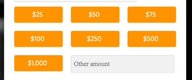
3. What goes up may bring average gift down: Test ask strings.
Hypothesis: The order of ask strings on a donation page can lift average gift size.
How to test it: Build two versions of your landing page with ask strings in descending and ascending order and randomly split traffic to each form.
Version A

Version B

4. How susceptible are your donors to peer pressure?
Hypothesis: Using visual indicators to call out the popularity of specific donation amounts on your donation form can increase average gift size.
How to test it: Create a test version of your standard donation page that includes language or visuals that show the user how much other people typically give (hint: use your average gift size here) to nudge them toward a larger gift amount. A/B test the two pages until you have a clear winner. Quick tip: Be sure to exclude your mid- and high-level donors from this test.
5. To incent or not to incent?
Hypothesis: Adding incentives for monthly giving can increase the conversion rate.
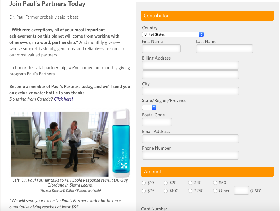
How to test it: Add monthly incentives to a donation form and test it against your standard donation form. Incentives could include a match for the first three months of monthly giving, a merch giveaway, or another special offer. Important caveats: (a) be sure the incentive is grounded in your mission so that you attract quality donors, and, related, (b) track the retention of the incentivized donors, to ensure any short-term gains aren’t offset by attrition. The example below features a monthly donation form from Partners in Health.

Measuring success: Make sure you take a full view of the impact of the test variation on revenue per form visitor. Evaluate form completion rate, average gift, and long-term revenue (i.e. taking into account the expected lifetime value of any increase in monthly gifts).
Hot tip: You can use a tool like AB Tasty or Google Optimizely to run your tests more efficiently!
Of course, there’s no need to try out every single one of these tests. Pick a couple that align with your fundraising goals and objectives for 2019, and table the rest for 2020.
Happy fundraising!
Got questions about donation form testing? We have answers. Shoot us a note!