National September 11 Memorial Museum
A best-in-class membership experience
The Challenge
To provide a better experience beyond the National September 11 Memorial & Museum’s grounds.
The Insight
The legacy technology platform was restricting the museum’s ability to customize messaging and user flow, creating a clunky experience for new members.
The Solution
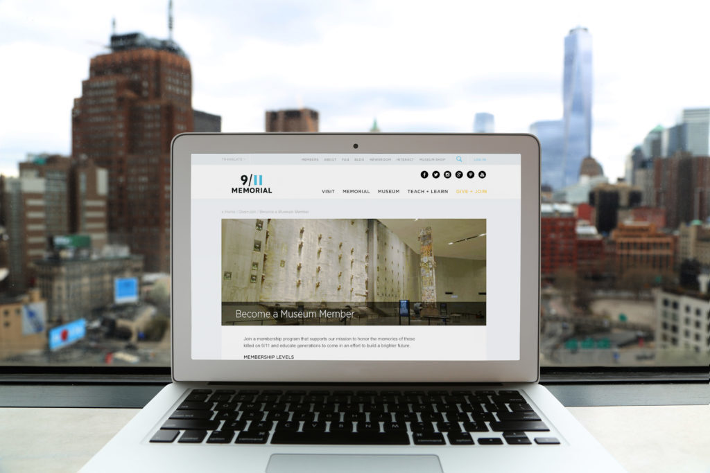
A redesigned membership experience and streamlined content pages meet visitors wherever they may be in their relationship with the museum.
People from all over the country visit the National September 11 Memorial & Museum seeking to honor the day and those whose lives were forever affected, but the story of 9/11 is bigger than a single day or place.
Since it opened in 2011, the Memorial & Museum has used digital to successfully expand its reach across the world. However, lack of integration made its systems increasingly difficult to maintain. The Memorial & Museum wanted to restructure its member portal, reimagine its member user experience, and create a best-in-class data and tech infrastructure to streamline its digital presence.
We brought cohesion to their technology platform by enabling systems to communicate in real time, freeing their employees from manually exporting and importing data in disparate systems. This would give members of the Memorial & Museum more up-to-date information, both when they signed up for a membership and after they visited the site.
We looked at… everything
We began by reviewing NS11MM’s unique structure, value proposition, mission, audience, and story. We then took a deep dive into their technical landscape to evaluate the relationship between the various systems that currently make up the membership experience, including the website, e-commerce platform, membership portal, ticketing system, online newsletter, and other third party data sources with fragmented authentication systems.
A simplified (and better) member experience
We quickly learned that the legacy platform was restricting the museum’s ability to customize copy, messaging, and the user flow—creating a suboptimal experience for new members. Disparities between online and offline member registration were also creating inconsistent records. Memberships purchased at the box office were entered into a different system and only later synchronized with a limited subset of constituent information.
Along with a cohesive set of technology recommendations, features, and backend optimizations to the structure of the data, pages, and systems, we redesigned the member experience with a new navigation and streamlined content pages focused on simplifying the experience for all visitors.
